Letztes Update: 28. September 2023
The Swiss stock year 2022 was not all that easy, especially if you are still relatively new to investing in the stock market and were spoiled by quite high returns in 2021. However, such a rather difficult year is very well suited to question your willingness to take risks. And if you only started investing in 2022 and entered gradually, the loss is very likely to have been limited.
In this post, I show you charts based on data from the “UBS ETF (CH) – SPI® (CHF) A-dis” (ISIN: CH0131872431). Why did I choose an ETF and not an index? Because the data of an ETF is publicly available and you can’t buy an index anyway, only an ETF. Despite everything, this is not a recommendation to buy or sell this ETF.
Share price development
This representation is probably familiar to all. In addition to the chart, the graph shows the returns for each year. The year 2022 was not exactly pleasing with its -16.56%.
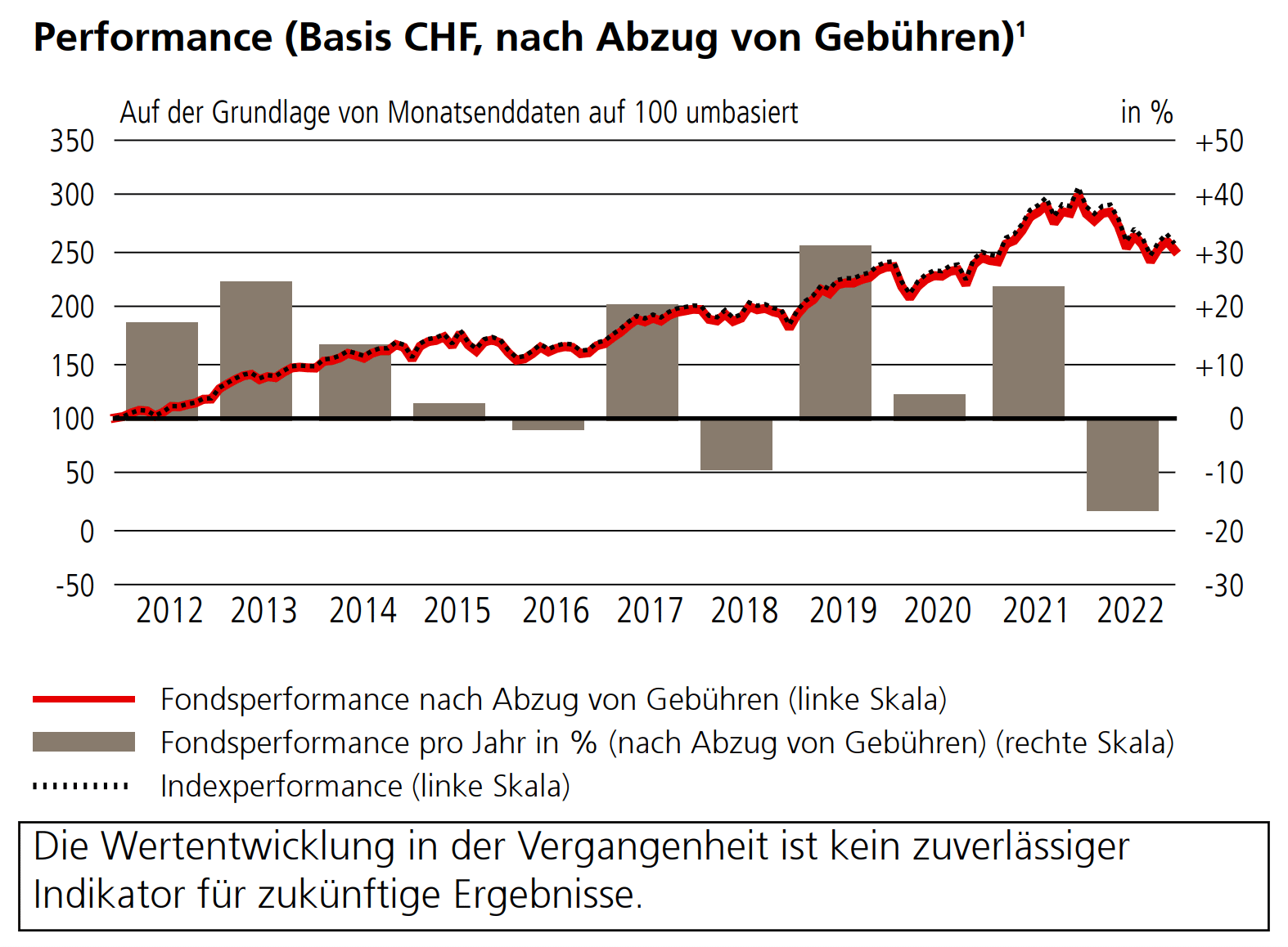
As a reminder, the Swiss Performance Index SPI comprises over 200 of the largest shares on the Swiss stock market and is weighted according to market capitalization. The largest position at the end of 2022 was Nestle with a weight of 20%, followed by Roche with 14.5% and Novartis with 13%. The SPI is a total return index, which means that dividend payments are taken into account in the index performance.
Daily Yields
Let’s take a look at the daily returns of our ETF. This representation is rather unusual and you usually don’t see it like this in the provider’s documentation. The return of each trading day is shown as a column. I have shown positive days in green and negative days in red. If you move the mouse over it, the respective daily returns are displayed.
The individual outliers downwards and upwards are quite impressive. For example, our ETF lost 3.7% on January 24, 2022. One stock market medium wrote on that day: “The Ukraine crisis and the prospect of rising interest rates in the U.S. formed […] a veritable poisonous mixture.”
On March 9, 2022, it has then gained just under 4.4%. Shortly to the difficulty with the percentage calculation: If an ETF falls by 4%, then a price gain of 4.17% is needed for it to return to its initial level. And if it falls by 50%, it must already increase by 100%.
But otherwise, admittedly, the whole thing seems pretty chaotic. That is why I have arranged the individual days in a histogram.
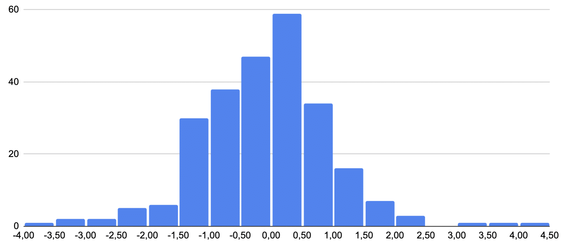
A histogram shows the distribution of returns generated by our ETF in 2022. It gives us an overview of how often certain return margins have been achieved. In our example, the return of the SPI ETF was between 0 and 0.5% on almost 60 days. And you can see at first glance that there are more days to the left of the zero than to the right – the annual loss of -16.56% must come from somewhere.
Annual returns
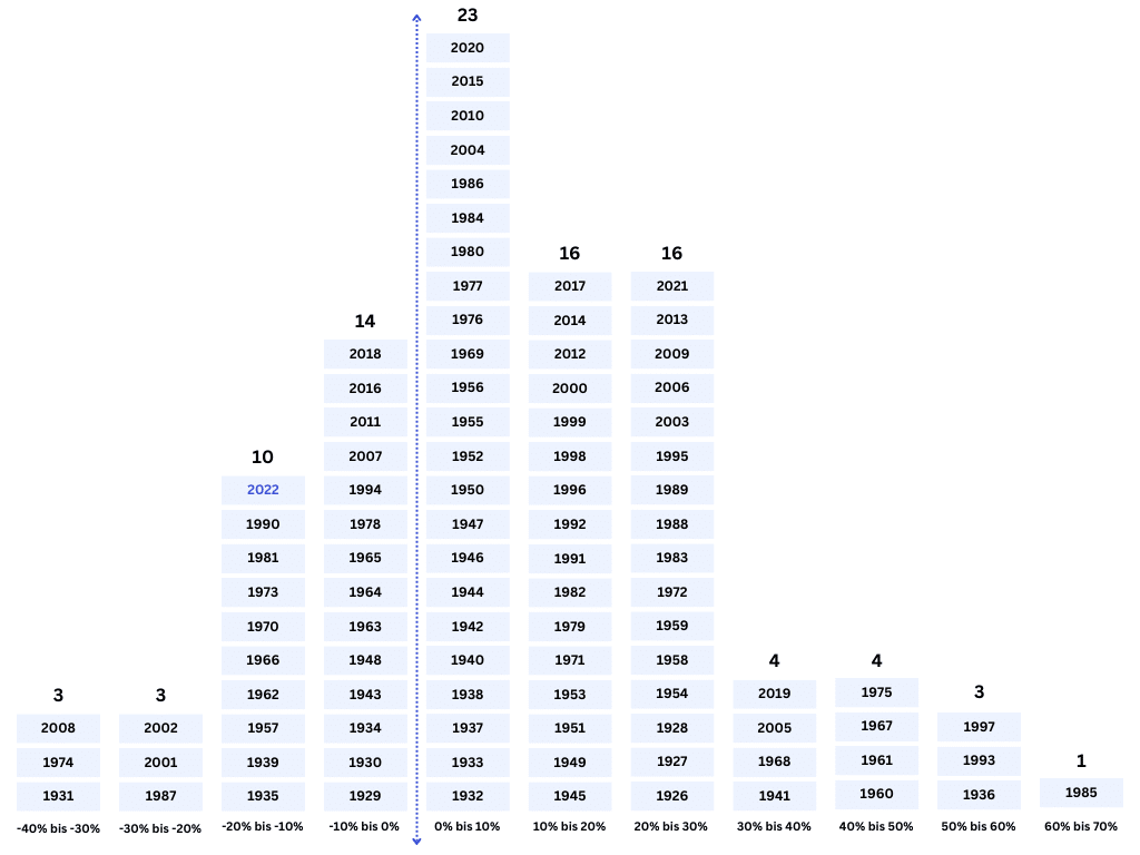
A single year is nice, but again, we’re more interested in the longer term. That’s why we’re looking a little further back. In fact, Pictet’s data goes back to 1926.
And there you can see that 2022 didn’t do particularly badly at all compared to other years. For example, the year 2008 closed with 34.05% in the red. The year 1985, on the other hand, was particularly good. The increase at the end of the year was 61.36%.
Already at first or second glance, it is noticeable that the number of green bars predominates in the long-term period. To illustrate this, I again used the Pictet data to create another histogram. Here you can see the yield distribution of the individual years.
Maximum Drawdown – Underwater Graphic
The underwater graph (is also called a drawdown chart) is a representation of the loss of a stock portfolio in relation to its peak level. It shows the percentage decline of the portfolio from its peak to a certain point in time. Over a longer period of time, this is what our ETF looks like:
So if you got in on December 28, 2021, your investments are still underwater. Since then, the ETF has not seen a peak. Or another example: If you entered on February 19, 2020, you had to wait 238 days until the ETF was back at the entry level. On the graph below, you can see the price history at the top and the underwater graph at the bottom.
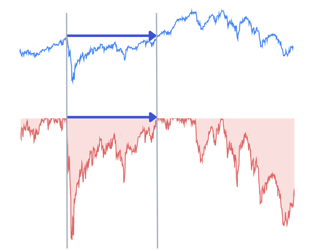
After the Corona crash, the stock markets recovered quite quickly. However, recovery can sometimes take several years.
Of course, the likelihood that you will have all of your savings invested at a peak is relatively small. In this respect, underwater graphics is more of a theoretical gimmick. But it can give you a better understanding of how your investments perform during market fluctuations and what losses have been expected in the past, or how long those losing periods have lasted.
Conclusion Swiss Equity Year 2022
If your investment strategy is based on several years or at best decades, you don’t need to care about the daily, weekly and yearly fluctuations. A year-end is merely a symbolic date and has no impact on a company’s fundamentals or the general economic situation, which ultimately influence the long-term performance of companies.
Transparency and disclaimer
I was not paid by anyone for this blog post, it reflects my subjective opinion.
If you open accounts or business relationships, order products or services through my links and codes, I may receive a commission for doing so. However, you will not suffer any disadvantages such as higher prices or the like. The terms and conditions of the respective providers apply. Affiliate links are marked with a *.
Investments are associated with risks which, in the worst case, can lead to the loss of the capital invested.
All publications, i.e. reports, presentations, notices as well as contributions to blogs on this website (“Publications”) are for information purposes only and do not constitute a trading recommendation with regard to the purchase or sale of securities. The publications merely reflect my opinion. Despite careful research, I do not guarantee the accuracy, completeness and timeliness of the information contained in the publications.